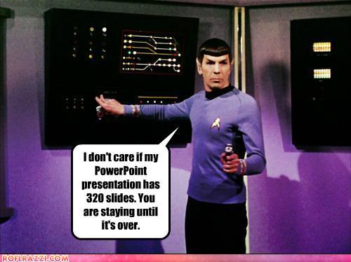
How your heart sinks when a presenter clicks to their next slide, only to reveal a wall of text, which they then proceed to read out: word, for word. We call it ‘PowerPoint karaoke’ and it grinds your audience down. It also provokes either complete disengagement or a stream of hostile attacks in your Q&A.
Karaoke works as entertainment because it’s so bad, its good. We also get to take turns. But PowerPoint karaoke is neither informative nor entertaining. And that’s the trick to a great presentation. Pure entertainment fails to inform but information without entertainment turns your audience off and sends them to sleep.
What’s the solution? Do you need your communications team to ‘sex-up’ your slides? NO! Just follow a few basic rules:
– Only put text on slides in titles. And only use one title per slide
– Wherever possible, use pictures, photos, graphics, images
– Don’t put extra text on a slide unless you absolutely have to
– Use text on slides as prompts for you to speak, don’t read it out
Believe it or not: your audience can read & listen as the same time.
Richard Darlington is Head of Strategic Communications at Well Told Story
Follow him on Twitter: @RDarlo


